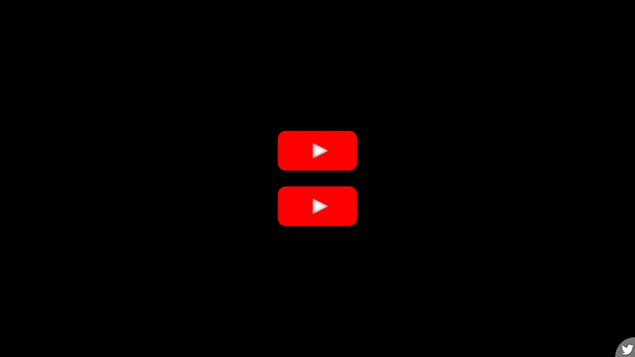
Просто перемещаемая иконка воспроизведения (HTML код)
<input type="checkbox" id="cb-pause">

<label class="playButton" for="cb-pause">

  <div class="icon pause">

    <div></div><div></div>

    <div></div><div></div>

  </div>

</label>


<input type="checkbox" id="cb-stop">

<label class="playButton" for="cb-stop">

  <div class="icon stop">

    <div></div><div></div>

  </div>

</label>


  <script src='https://assets.codepen.io/1948355/twitterButton-2.1.0.js'></script>
Просто перемещаемая иконка воспроизведения (CSS код)
*, *::before, *::after {

  padding: 0;

  margin: 0 auto;

  box-sizing: border-box;

}


body {

  background-color: #000;

  color: #fff;

  min-height: 100vh;

  display: flex;

  flex-direction: column;

  align-items: center;

  justify-content: center;

}


input[type=checkbox] {

  -webkit-appearance: none;

     -moz-appearance: none;

          appearance: none;

  position: fixed;

  top: -100%;

  left: -100%;

}

input[type=checkbox]:checked + .playButton {

  --ry: 90deg;

  --clr: maroon;

}


.playButton {

  position: relative;

  width: 160px;

  height: 80px;

  border-radius: 10%/20%;

  background-color: var(--clr, red);

  perspective: 320px;

  cursor: pointer;

  margin: 1em auto;

  transition: background-color 0.5s;

}


.icon {

  position: absolute;

  top: 50%;

  left: 50%;

  transform: rotateY(var(--ry, 0deg));

  transform-style: preserve-3d;

  transition: transform 0.5s;

}

.icon.pause > div {

  position: absolute;

  background-color: #fff;

}

.icon.pause > div:nth-child(1) {

  top: -15px;

  left: -9px;

  width: 30px;

  height: 30px;

  -webkit-clip-path: polygon(0 0, 100% 50%, 0 100%);

          clip-path: polygon(0 0, 100% 50%, 0 100%);

  transform: translateZ(-5px);

  background-image: linear-gradient(334deg, #0005 12px, #0000 19px), linear-gradient(206deg, #0005 12px, #0000 19px), linear-gradient(90deg, #0005, #0000 7px);

}

.icon.pause > div:nth-child(3) {

  top: -15px;

  left: -9px;

  width: 10px;

  height: 30px;

  transform-origin: left;

  transform: translateZ(-15px) rotateY(-90deg);

  box-shadow: 0 0 5px #0005 inset;

}

.icon.pause > div:nth-child(2) {

  top: -15px;

  left: -9px;

  width: 30px;

  height: 30px;

  -webkit-clip-path: polygon(0 0, 100% 50%, 0 100%);

          clip-path: polygon(0 0, 100% 50%, 0 100%);

  transform: translateZ(15px);

  background-image: linear-gradient(334deg, #0005 12px, #0000 19px), linear-gradient(206deg, #0005 12px, #0000 19px), linear-gradient(90deg, #0005, #0000 7px);

}

.icon.pause > div:nth-child(4) {

  top: -15px;

  left: -9px;

  width: 10px;

  height: 30px;

  transform-origin: left;

  transform: translateZ(5px) rotateY(-90deg);

  box-shadow: 0 0 5px #0005 inset;

}

.icon.stop > div {

  position: absolute;

  background-color: #fff;

}

.icon.stop > div:nth-child(1) {

  top: -15px;

  left: -9px;

  width: 30px;

  height: 30px;

  -webkit-clip-path: polygon(0 0, 100% 50%, 0 100%);

          clip-path: polygon(0 0, 100% 50%, 0 100%);

  transform: translateZ(15px);

  background-image: linear-gradient(334deg, #0005 12px, #0000 19px), linear-gradient(206deg, #0005 12px, #0000 19px), linear-gradient(90deg, #0005, #0000 7px);

}

.icon.stop > div:nth-child(2) {

  top: -15px;

  left: -9px;

  width: 30px;

  height: 30px;

  transform-origin: left;

  transform: translateZ(-15px) rotateY(-90deg);

  box-shadow: 0 0 10px #000a inset;

}
Просто перемещаемая иконка воспроизведения (Результат кода)
Comments